

Evita
Evita is a continuous wearable monitoring system to assist chemotherapy patients in symptom, side effect, and vital sign tracking.
Year
2023
2024
Timeline
Research | 15 Weeks
Design Development | 15 Weeks

Discreet, accurate, and comfortable, the evita monitor places control back into the patients hands after they leave the hospital, giving patients and their loved ones peace of mind over their condition.
The evita app connects the monitor to the patient seamlessly, providing vital sign data, side effect input, chemotherapy cycle tracking, and more.

1 in 3 people undergoing treatment for cancer experience major mental or emotional distress due to their diagnosis and subsequent effects of treatment.
Studies have shown that patient understanding and at home monitoring improve the quality of life of patients and their families, in addition to increasing chances of survival and a healthy lifestyle post-treatment.

Evita's Strategy

Access
This data is shared with the user as well as their designated medical staff and caretakers through the Evita app. With this data in the palm of their hand, patients understand the changes happening to their body due to chemotherapy outside of the hospital/infusion center environment.

Communicate
With the Evita app, patients can communicate with their doctors and loved ones about their progress through treatment in one convenient application. The Evita app offers cancer patients total autonomy over who is seeing what, and gives them a space to safely blog and catalogue their experience.

Assess
The more patients use Evita, the more Evita helps the patient. By inputting side effects as they occur, the Evita app can analyze cycle patterns to predict future side effects or physical reactions. With these predictions, patients can respond proactively instead of reactively when combatting debilitating side effects.

Monitor
Taking data from single lead ECG, as well as PPG technology, the Evita monitors vital signs including heart rhythm, heart rate, blood pressure, and pulse oxygenation. With patient input, the app tracks side effects and medication administration, acting as a command center for all things chemotherapy. Without compromising accuracy, Evita should be discreet and comfortable for everyday use.


Form & Material Inspiration
While researching precedents and existing products, I curated a mood board to established the desired colors, materials, finishes, and interaction points of the wearable Evita monitor. During the research portion of this project, I also identified viable placements where this monitor could most accurately and discreetly monitor the desired vital signs. The blue dots on the figure below indicate ideal monitor placements for adults patients.


Developing Evita required understanding how each component interacts with each other to become an easily understandable system of parts. The monitor can be placed by a single user or with help from a caretaker.
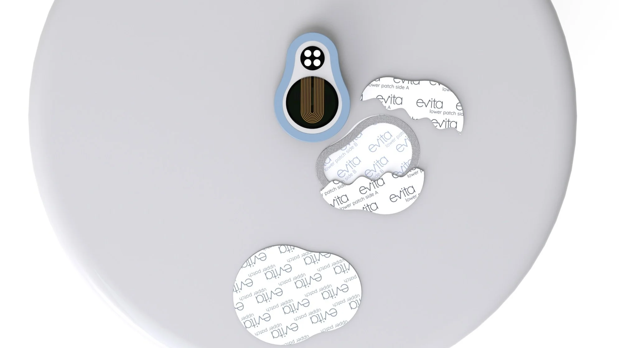
What’s Inside
Upper medical grade adhesive patch
Medical grade plastic monitor top housing & start button
PCB Board
Medical grade plastic monitor bottom
Single lead ECG, top rests in housing, bottom makes contact with skin.

Flexible silicone housing fits different body types comfortably.
Wireless charging receiving coil
Lower medical grade adhesive patch
LED PPG Unit

The Evita monitor includes a wireless charging stand and wireless charging module, allowing patients to continue monitoring vital signs while charging. Only adding 4.5 millimeters to the overall thickness of the monitor, Evita’s thin design stays comfortable during charge periods.
Using the Evita monitor
-
![]()
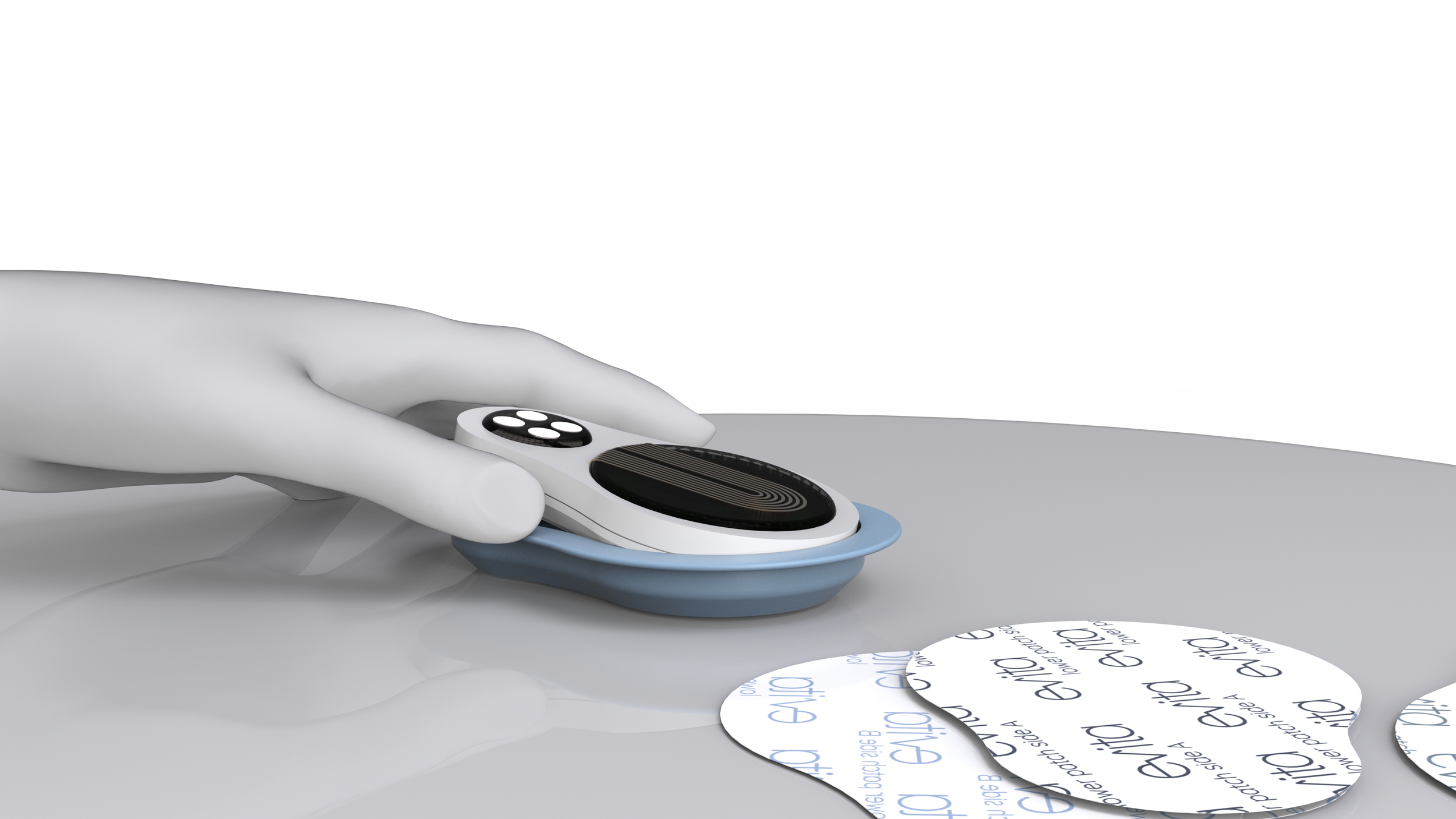
Place Monitor in flexible silicone housing.
-
![]()
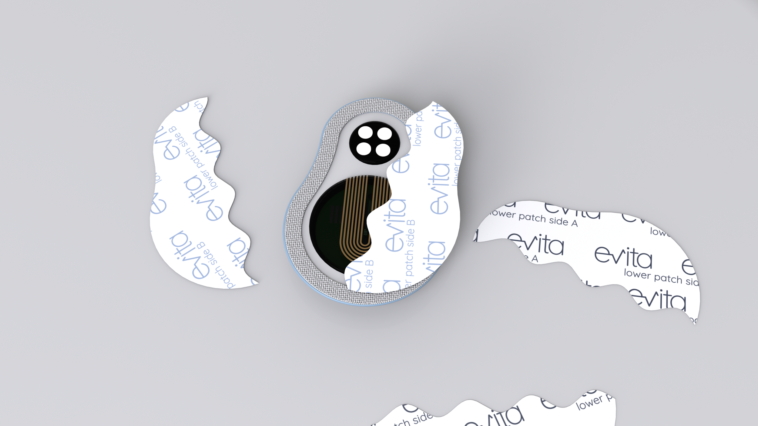
Remove backing A from the lower adhesive patch, labelled accordingly.
-
![]()
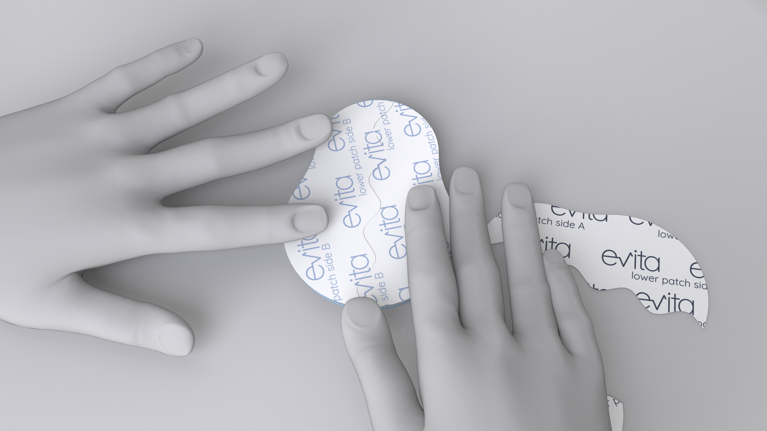
Using the "lower patch size B" paper backing as a guide, adhere tape to monitor back.
-
![]()
Remove protective backing B from lower patch.
-
![]()
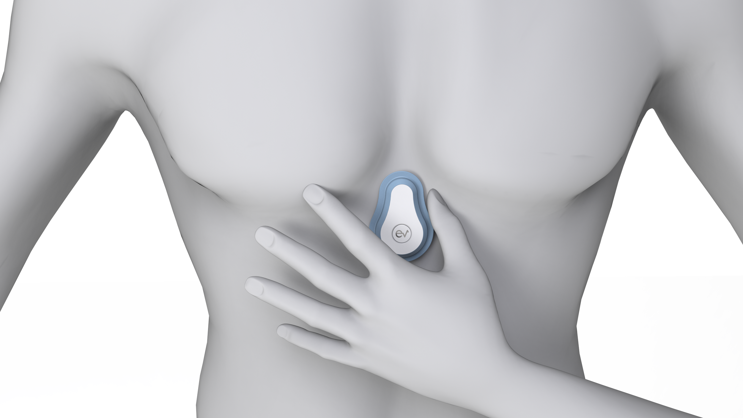
Place monitor in center of the chest, between the pectoral muscles and directly above the Xiphoid Process, pressing firmly to adhere to skin.
-
![]()
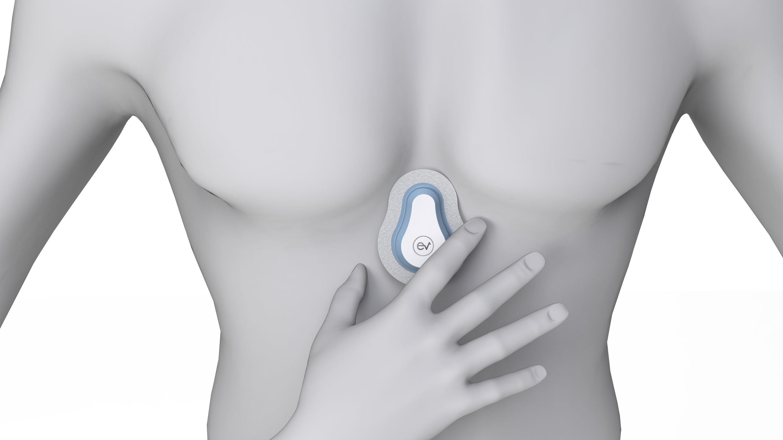
After removing protective backing from the upper patch, place around the monitor, pressing firmly to ensure adhesion to the flexible silicone housing and skin.
-
![]()
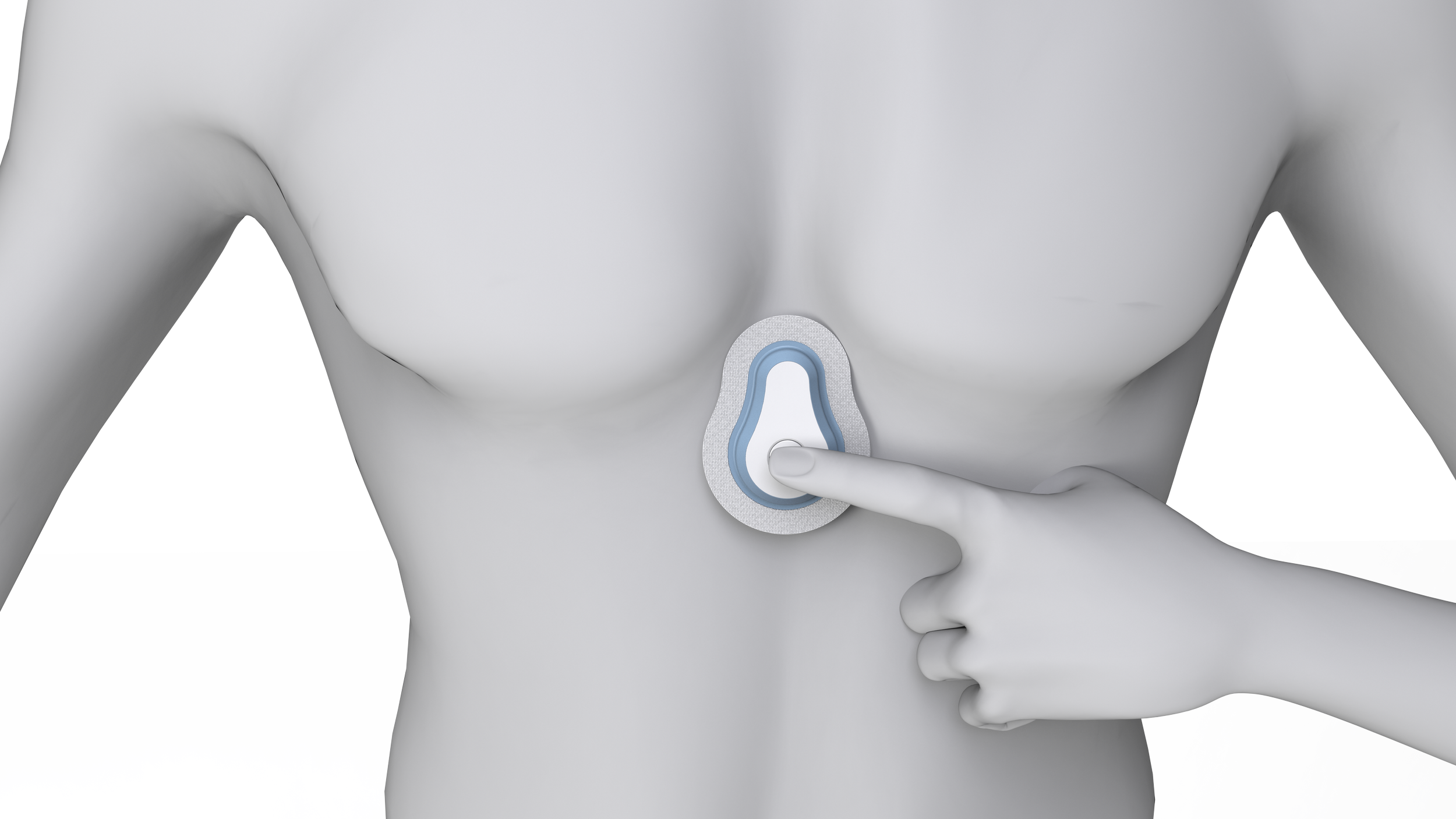
Press and hold the "EV" button for 3 seconds to turn monitor on.
-
![]()
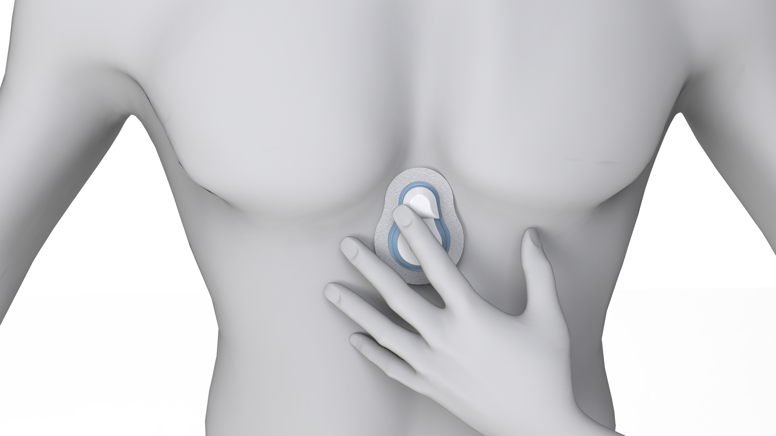
Running low on battery? Place the magnetic charging module over the top portion to wirelessly charge Evita. The evita monitor has a battery life allowing 14 days of continuous use, and takes 180 minutes to charge.
Evita for Everyone

With various skin tone variations, evita can be discreet for people of all races….

….And more colorful options are available for childhood cancer patients.
Branding Development
I really wanted evita to be named and branded as more of a companion and tool than a medical device. The name evita contains the root -vit coming from Latin, meaning life. Evita as a name means living one. The symbolism of this is strong, showing that a cancer diagnosis and chemotherapy treatment does not have to take away from living fully and unapologetically.
When selecting the typography for Evita, many sans serifs were explored since they communicate effectiveness and professionality. Many existing consumer medical products rely on this type of font, and the gentle curves of quicksand light and quicksand regular were selected.
Logo Ideation

To indicate the major function of evita as a vital monitor, I decided to incorporate the result of a heartbeat on EKG machines, a common symbol many people will understand without explanation.
Final Branding Package
Primary Logo

Secondary Logo

Logo Mark

App Icon

Typography Exploration

Color Exploration

Since part of this project was the UI/UX design of the accompanying app, I wanted to include this color palette as part of the branding identity. The app required 1-2 colors to warn users of unhealthy vital markers, which I tested with the existing brand colors for continuity.
Brand Colors

Black & White


Typography

Evita App Color Palette


The Evita app: your health in your hands


The evita app connects users to their vital data in real time, and shares them with certified caregivers in a safe and secure way. Since chemotherapy treatment is cyclic in nature, the app gives a platform for patients to input their side effects and symptoms, and uses this data to anticipate what to expect during the next cycle. The app’s other features include an appointment calendar, medication list, messaging, blogging, and activities and advice to keep the patient healthy and happy.